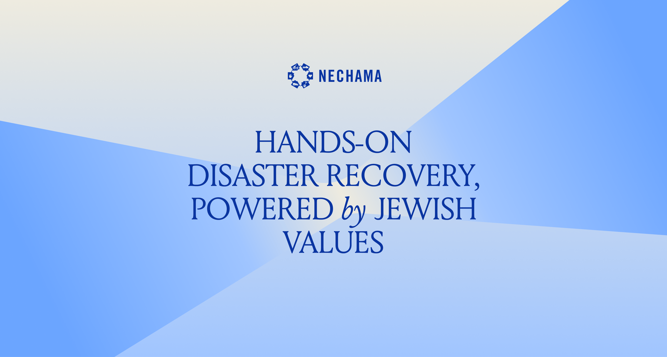
NECHAMA is a national Jewish disaster relief nonprofit that underwent a major strategic evolution following a leadership transition in 2024. The organization expanded its mission to position itself as a "Jewish organization first, disaster relief second," using physical relief work as an active platform to build Jewish identity, foster community engagement, and address antisemitism.
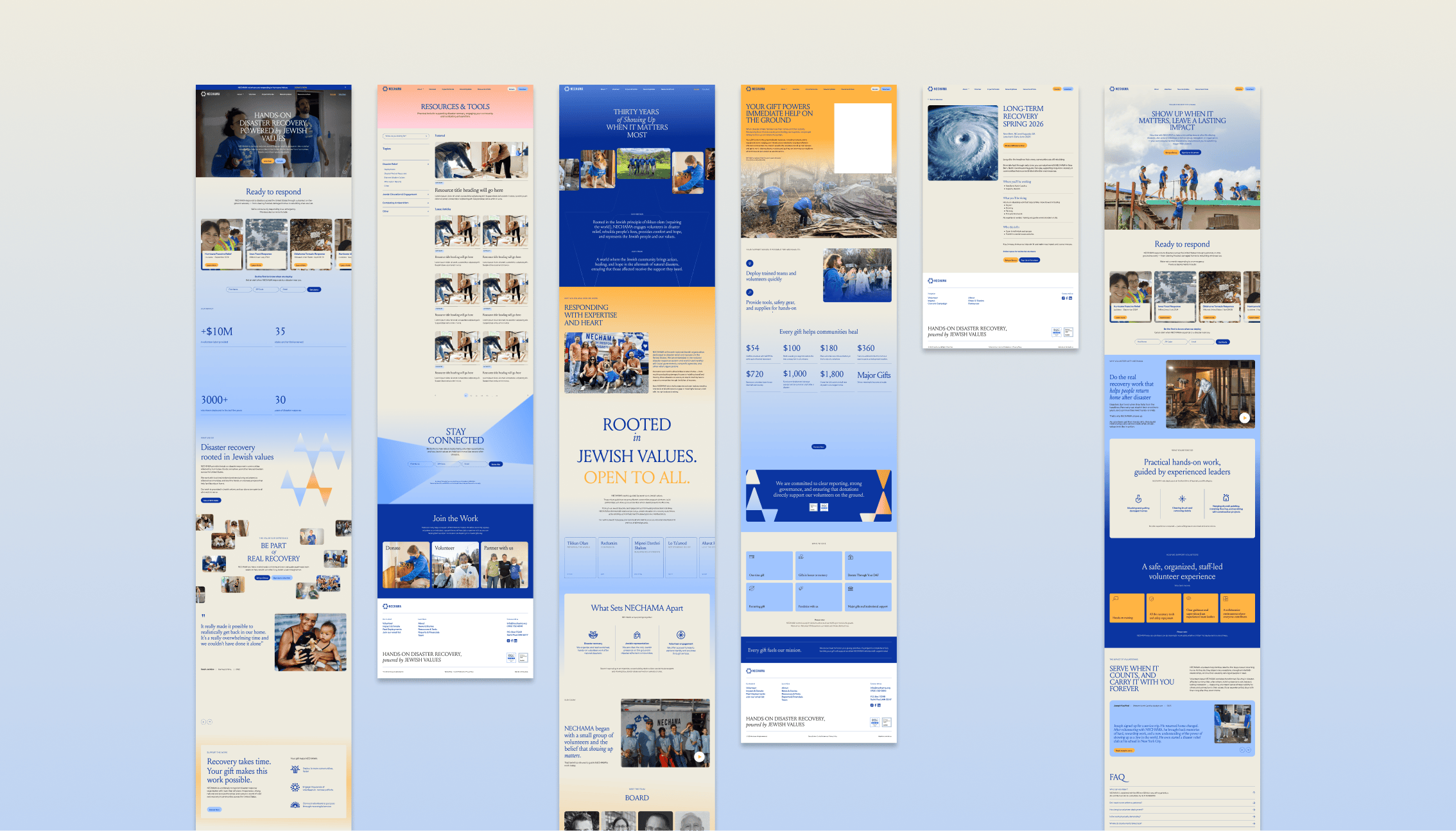
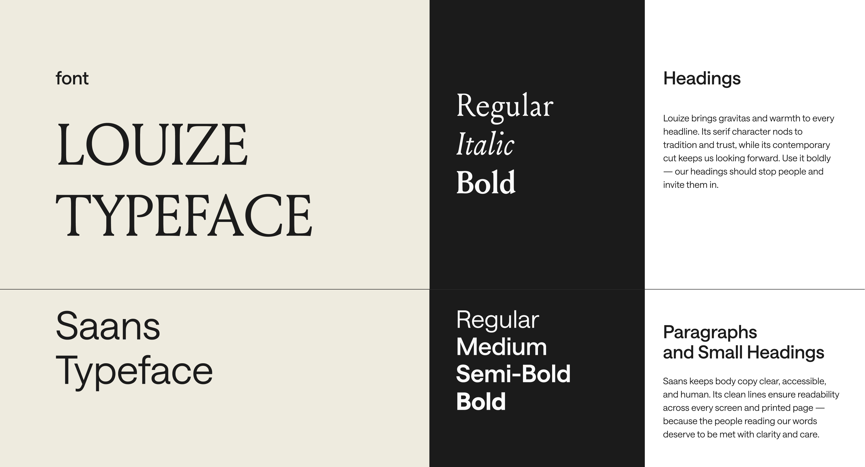
As part of my role as a designer at Verticalloop, I worked on the NECHAMA account as part of a collaborative team led by Art Director Shiran Berry. Working within the strategic framework established by the studio and the client, I translated the team’s high-level creative direction and conceptual thinking into visual execution. My core focus was designing the visual identity refresh and crafting the end-to-end UI for the new website to align their primary digital touchpoint with this next chapter of growth.
To guide the design process and meet the needs of all stakeholders, the team defined five key objectives for the new platform:
A core component of the rebranding was the development of a purposeful, highly symbolic color palette designed to balance deep cultural roots with a powerful sense of hope. Developed at Verticalloop under Shiran Berry’s art direction, the visual identity is anchored by rich blues, chosen to honor Jewish heritage, tradition, and foundational community values. To balance the demanding nature of relief work, the palette incorporates vibrant yellows and warm oranges reminiscent of a sunset, infusing the brand with energy, renewal, and comfort. The resulting system moves away from purely conventional relief aesthetics, creating an engaging digital environment that feels welcoming, human-centered, and optimistic.

As part of the project at Verticalloop, I developed a custom graphic system rooted in the deconstruction of the Magen David. Exploring ways to reinterpret the traditional star into modern visual building blocks, I opened the form into directional triangles that evoke beams, architectural structures, and dynamic pathways.
These modular shapes anchor the brand in its foundational Jewish heritage while visually signaling forward momentum, open outreach, and collaboration. The resulting graphic toolkit creates an adaptable visual language that reinforces NECHAMA’s mission to connect and build bridges across diverse communities.

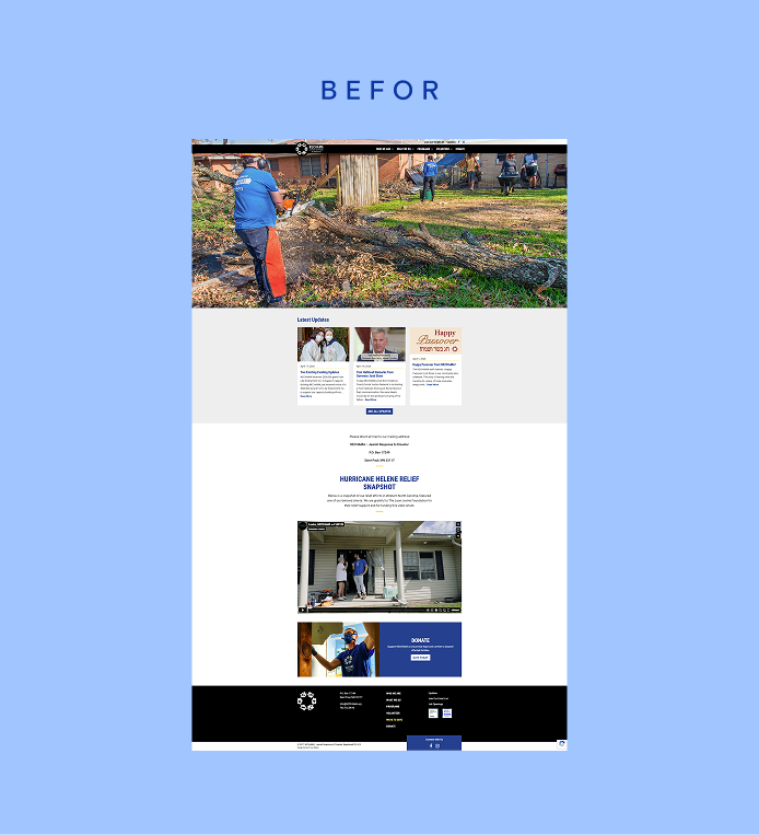
Following its leadership transition and evolving mission, NECHAMA required a refreshed digital presence that could effectively support its expanding scale and ambitious vision. The existing platform, built years earlier, was no longer aligned with the organization's evolving narrative and multi-audience engagement model. The primary challenge was to transition from a static setup into an adaptable, modern ecosystem capable of delivering an inspiring first impression, providing intuitive navigation for diverse audiences (from individual volunteers to institutional foundation donors), and offering the internal team seamless content management capabilities.
Developed at Verticalloop under the art direction of Shiran Berry, the new platform translates NECHAMA's strategic evolution into a cohesive, welcoming digital experience. Working as part of the studio design team, I helped bring this vision to life through a refreshed visual system, an intentional color palette, and an intuitive UI/UX architecture.