Rebranding · Visual Identity
The Context
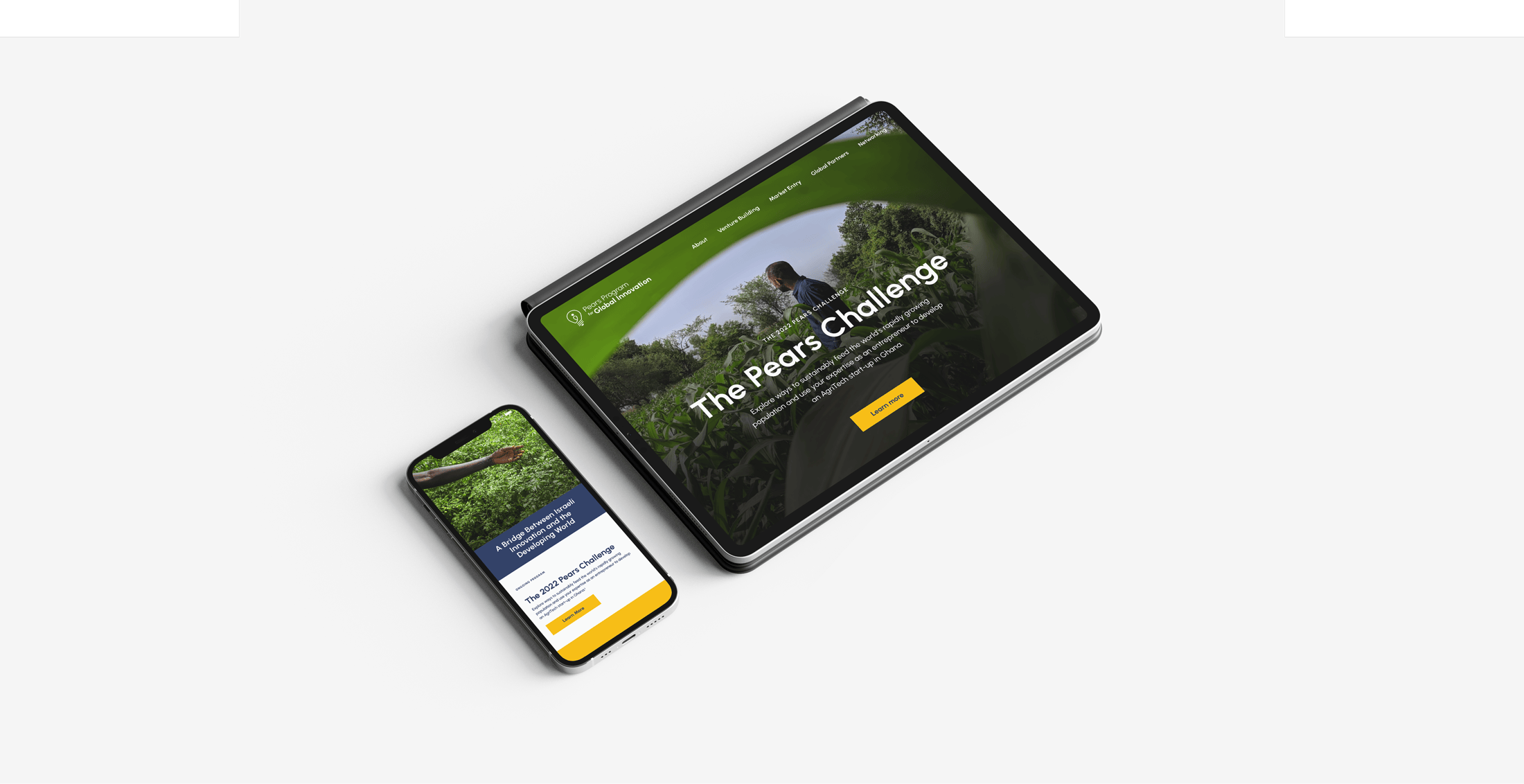
The Pears Program for Global Innovation is a leading force in catalyzing changemakers and devtech entrepreneurs. During my time at Verticalloop, our team supported the continuous evolution of the organization’s visual presence, adapting the visual language annually to match the dynamic goals of the "Pears Challenge" and its impact across global innovation.
The 2025 Evolution: From Pears to Nura
In 2025, the organization strategically rebranded as Nura. Working as part of the design team at Verticalloop, I helped translate this new direction into a cohesive, refreshed visual identity tailored to the climate-tech ecosystem.
My Role & Key Contributions
Collaborating closely with the studio’s creative team, my focus was on hands-on design, visual consistency, and asset execution across key touchpoints:
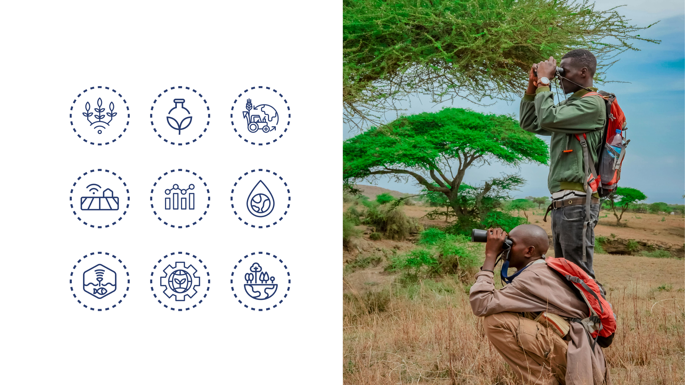
Visual Identity & Guidelines: Contributed to crafting the visual system—including the updated logo application, refined color palette, and a custom icon set reflecting Nura's mission.
Design System & Cross-Platform Collateral: Built practical design assets to ensure clear and consistent brand execution:
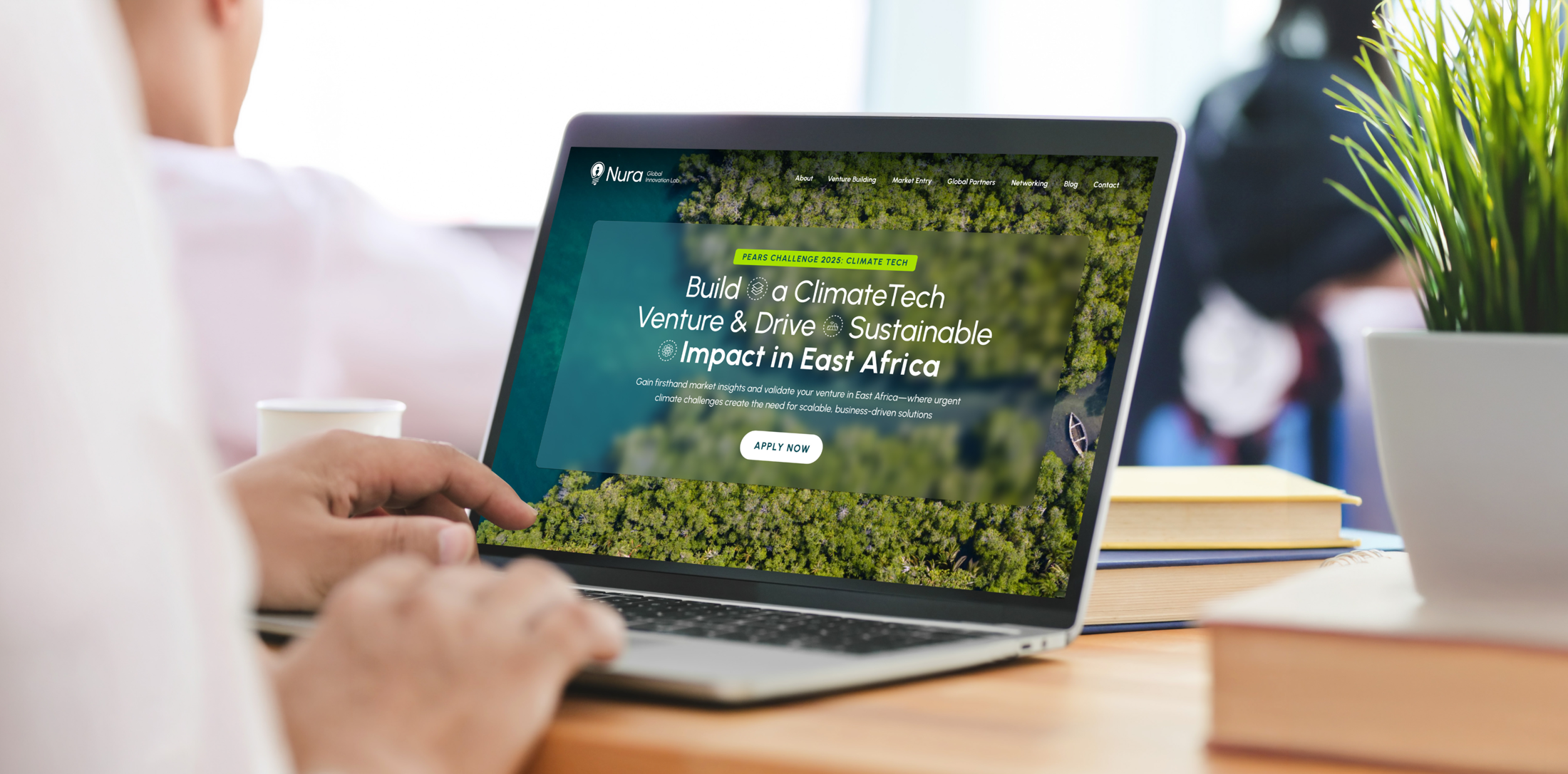
Digital Interface: Designed the landing page UI for the 2025 Challenge, streamlining the user experience to support community engagement and program applications.
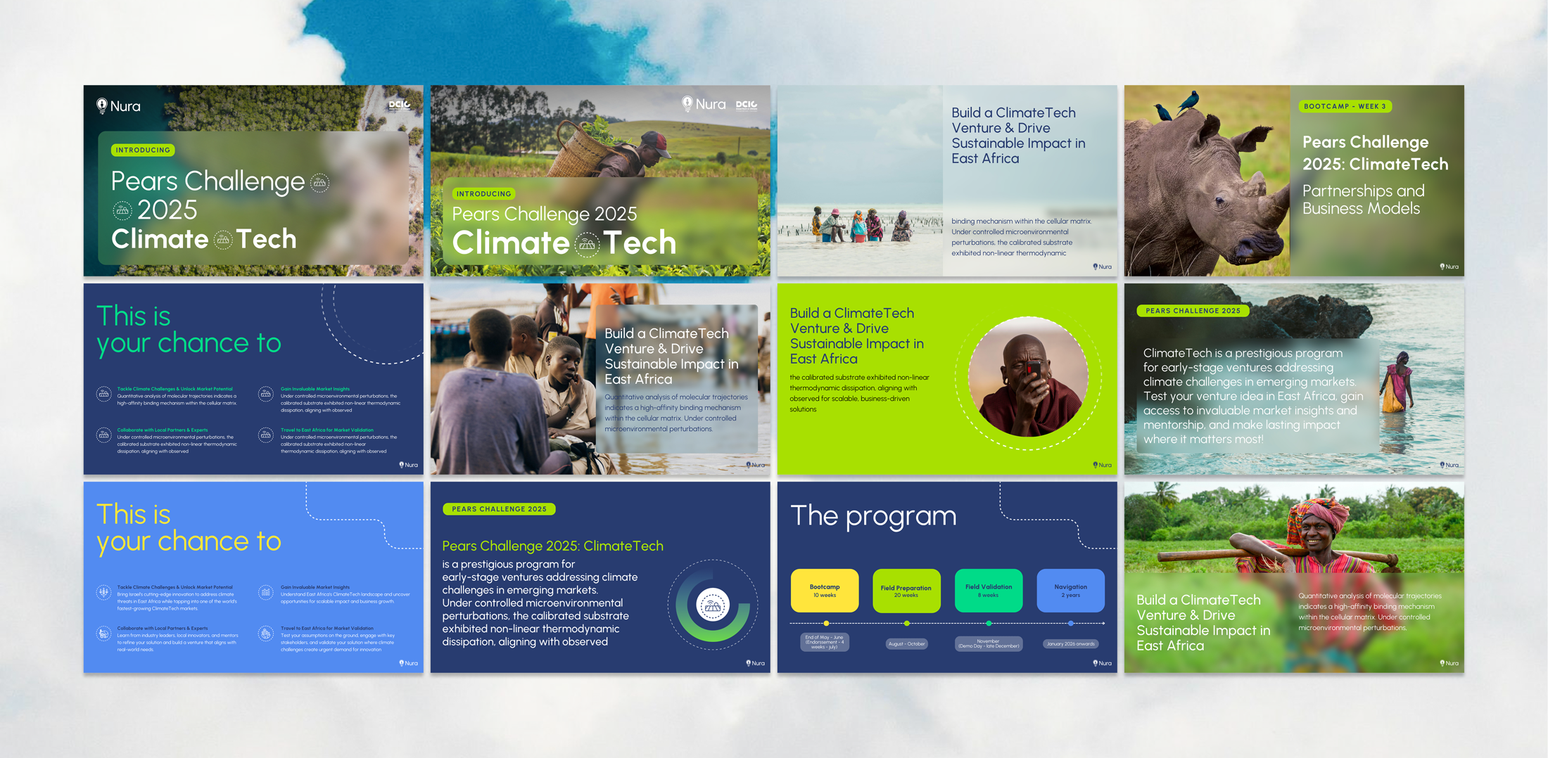
Presentation Design: Developed modular, high-impact presentation decks and slide templates built to communicate complex climate-tech data clearly.
Social Media & Outreach: Created structured social media templates and promotional graphics to support the public rollout of the new identity.
Visit the live site ↗The New Mark
The original symbol—combining a lightbulb and a human figure—was originally created at Verticalloop for the Pears Program. During the organization’s transition and rebranding to Nura, the client wished to retain the core identity of the iconic mark while adapting it to its new name.
My role was to refine and evolve the existing identity: updating the typography to integrate the new name seamlessly, fine-tuning the balance, and introducing a refreshed color palette to give the established symbol a modern, dynamic look.